01
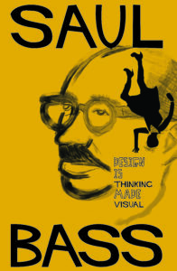
Saul Bass Tribute
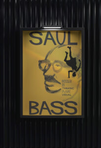
As a lifelong admirer of Saul Bass, I was thrilled to design and illustrate this tribute poster. Bass’ work is iconic for its bold simplicity, striking use of negative space, and hand-drawn typography, all of which inspired my approach. I began by photographing a model to use as a reference for the girl in the poster, aiming to capture the graphic, stylized look reminiscent of Bass’ work on Alfred Hitchcock’s Vertigo.
Next, I studied images of Saul Bass to create a sketch of his face in a similarly minimalist and expressive style. To complete the piece, I added text in a handwritten style inspired by Bass’ distinctive typography, tying the composition together and honoring his unique approach to graphic design.
02
Hunger Hides
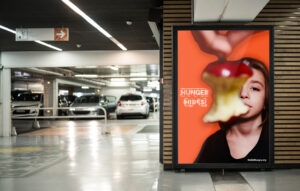
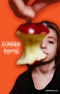
This project is a composite of photography and digital artwork, created in Photoshop. I photographed the original image myself, with my son as the subject and my daughter assisting during the shoot. The poster was part of a group project where we each researched causes we cared about and collaboratively developed a design.
Inspired by imagery used in No Kid Hungry campaigns, we incorporated the apple as a central visual element. Our tagline, “Hunger Hides”, was meant to emphasize that food insecurity isn’t always visible – any child could be struggling without others knowing.
The message behind the design highlights how children facing hunger may suffer serious long-term effects, including health issues, depression, stress, and anxiety caused by uncertainty about their next meal.
The call to action is simple: we can all make a difference by supporting local food banks, donating to nonprofits like No Kid Hungry, or volunteering at community food drives and soup kitchens.
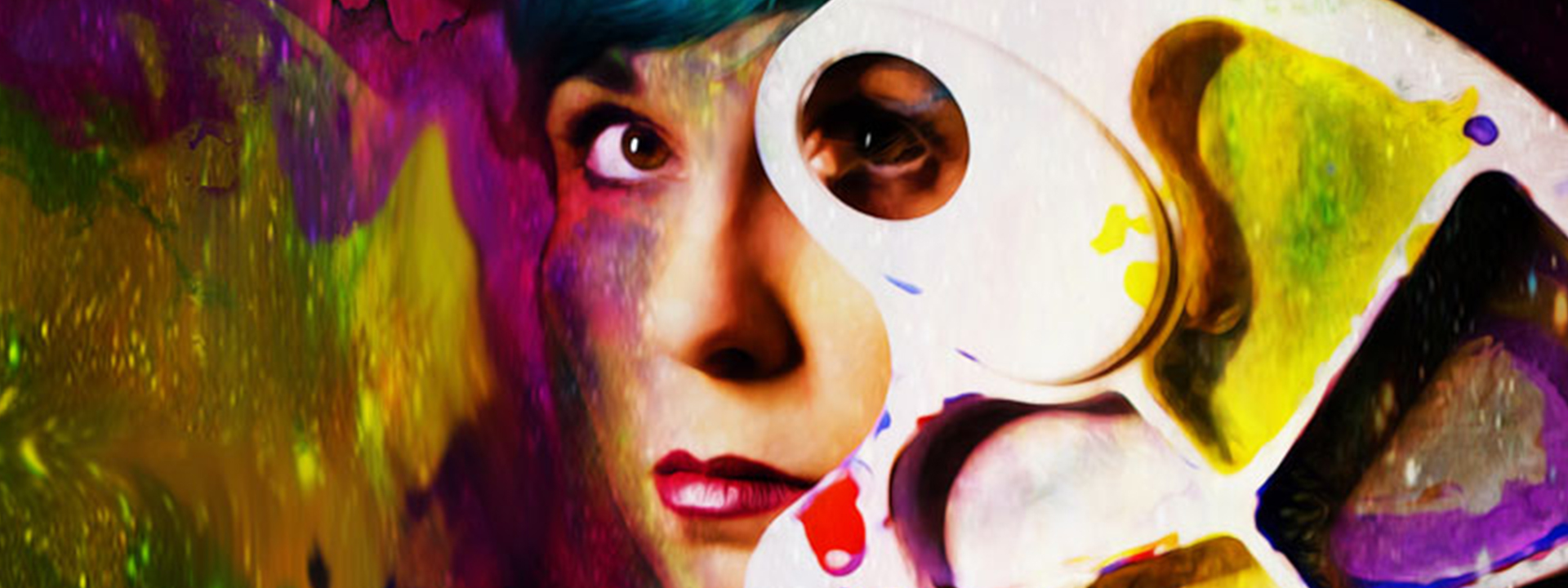
03
The Glory of Ten
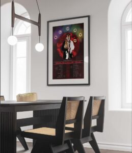
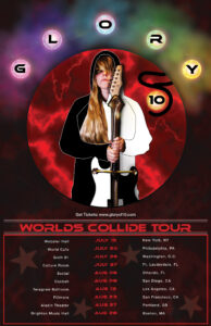
This band poster is a composite of photography and digital artwork created in Photoshop, Illustrator, and InDesign. I shot the original photo myself and developed the effects to bring the concept to life.
The poster promotes The Glory of Ten, an imaginary all-female band that blends techno-pop with electric strings. To capture their aesthetic, I used a striking image of a woman as the focal point, combining a sword and an electric guitar to convey strength and empowerment. I stylized her hoodie as a cutout rather than keeping it realistic, which added ambiguity to her figure and shifted the focus away from sex appeal.
Thematically, I wanted to fuse myth and modernity. Classical elements like violins and cellos were incorporated alongside electric instruments to reflect this mix. My visual inspiration drew from the energy of bands like Bond (an electric string group) and the bold style of Gwen Stefani.
The sword became a central design element, symbolizing balance, strength, and mythology. I drew on stories of the legendary “Glory of Ten Powers” sword, which represents yin and yang, synergy, and transformative power. This symbolism informed my choice of a black-and-white palette contrasted with vibrant chakra-inspired colors. The glowing orbs and flowing electricity tie back to the band’s techno-pop sound, reinforcing the connection between music, energy, and myth.
04
05
06
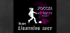
Sports Posters
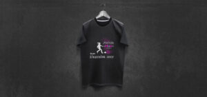
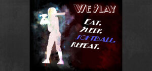
When my daughters were younger, they were both very involved in sports – one loved softball, and the other loved soccer. I created a series of custom designs for each of them, which I used as posters and on t-shirts. The fifth poster image below of the soccer ball was created entirely in Illustrator using vector art, with each individual segment designed as a separate shape. The sports images of the girls were created from photographs in Photoshop.
07
Save Fun
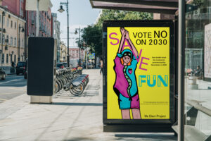
This playful illustration was created for a school project. I first drew it in Procreate and then brought it into Illustrator to incorporate the text. I wanted the character’s arms to become part of the lettering, so I designed them to resemble someone forming the letter “A” with their arms.
08
Let’s Create
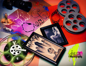
I created this flat lay by arranging colorful sheets of construction paper as a background, then carefully placing objects such as a clock and shot glass into the composition. I added hand-painted text reading “Let’s Create” along with paint splatters to enhance the playful, creative feel. After photographing the arrangement, I finalized the image with edits in Photoshop.
09
#Vaccinated
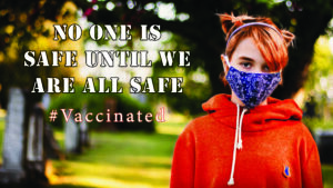
I designed this poster for an online contest held during the peak of COVID-19. The goal of the contest was to create a design that encouraged people to get vaccinated.

Posters